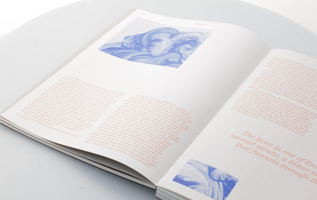
"I just spent the last hour flipping the pages of the print edition. I am speechless. I was emotionally moved by the experience."
Emmanuel Vaughan-Lee - Emergence Magazine
From first phone call to beautiful Emergence magazine
It's November 2018. End of day. The phone's ringing. My colleague Sandra picks up and I hear her mention my name and she connects. A nice voice on the phone. Or it's true that we print Foam magazine. They are working on a new magazine for a client in America and the Foam magazine looks so well taken care of. They need a global price for now in order to be able to discuss this with their customer and two days later we will send a first draft.
What can you expect? My opinion is that I always try to get the best out of us in order to deal with these kinds of questions very neatly and to make a clear story. Sometimes it disappoints you but in this case it was the start of a very nice magazine, Emergence Magazine (gold at the european design awards 2020) where I often enjoyed browsing and sent the american customer a nice emotional message after he held the first printed copy in his hands. More about that later
What is Emergence Magazine
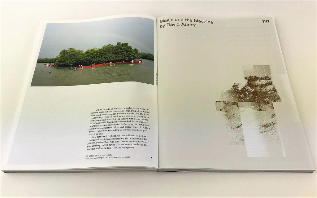
Launched in the spring of 2018, Emergence Magazine is an award-winning quarterly online publication exploring the connections between ecology, culture and spirituality. The authors include Sundance-winning and Emmy-nominated filmmakers, Pulitzer finalists, Ted winners and a Poet Laureate. Each issue has a theme that is explored through innovative digital media and the written word. The platform includes films, tailored experiences, podcasts, photo essays and articles with 150,000 unique visitors per month. In this link a wonderful film to give an idea of the topics and in between some sneak previews of the printed magazine.


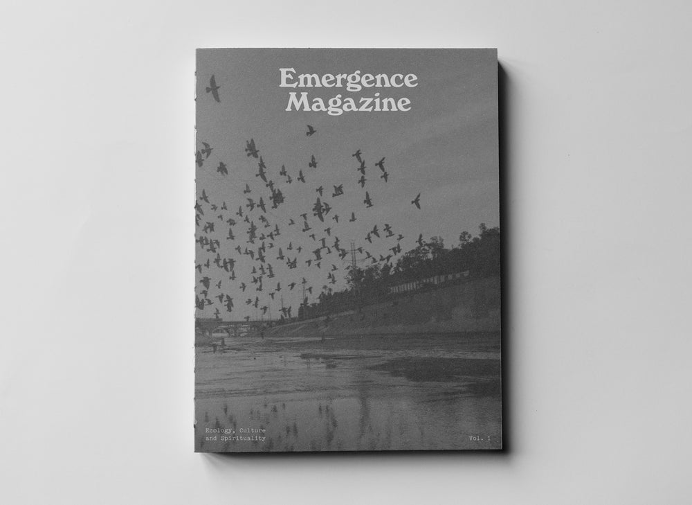
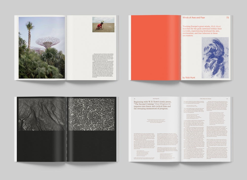
In the end, it was decided to make a summary of the four online publications each year, which will be published in print. This is how EMERGENCE MAGAZINE VOL.1 was born.
The challenge of Studio Airport from Utrecht (Bram, Maurits and Carsten), who also provide the online versions, was to turn it into a very nice tactile and intimate magazine that would actually function as a book. Matching the look and feel of the online version.
The client has given the designers free rein to find the right paper types in combination with the use of colour and binding.
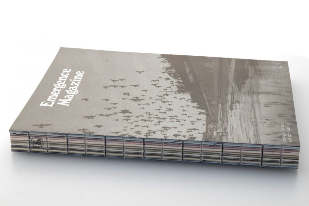
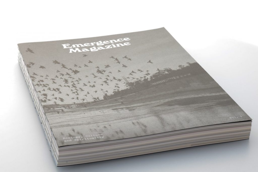
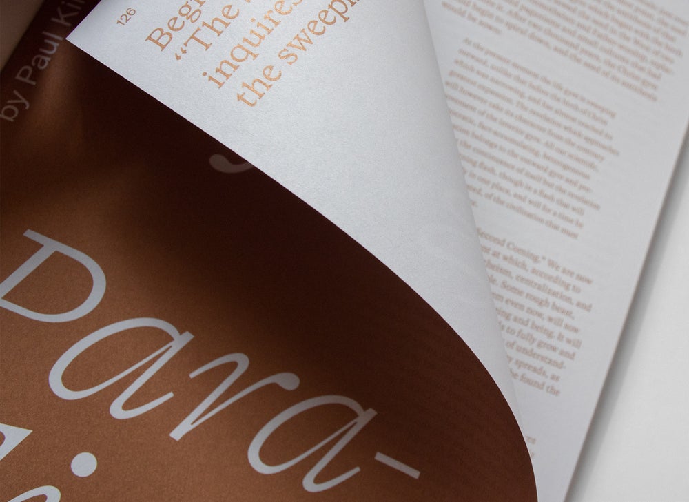
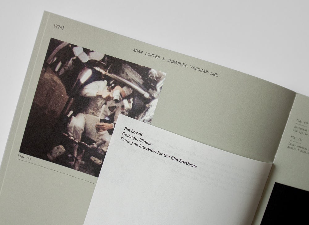
In the end this resulted in a magazine with 296 pages inside on 8 different types of paper, in FC and 11 PMS colours throughout the magazine. And the 2x 4 page cover on black offset printed in silver and a white foil/preeg.
Because of all the different types of paper, the lithography is not self-evident. Taking into account all the different surface structures, colour of the paper, we have looked at and adjusted each image separately and we have made several press proofs. The cover with silver has been printed with the customer to the press in different gradations in order to determine the best combination. Virtually nothing was left to chance and the customer was informed about the progress on a daily basis in America.


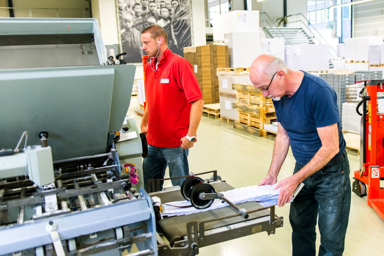
In the end everything is tied at bindery Patist in Den Dolder under the critical eye of Mike Silva. There too, the client was there to experience what is involved and to see the magazine come to life. Because of some narrower and shorter pages in the inside, not everything was self-evident. The right weft is then essential. The foil on the cover pages was provided by Finishing Touch from Nuth.
The binding is sewn with black thread as a nice detail and a glued back. And then the subtle logo appears on the back.
Then it is ready and the print run had to be shipped to America in July 2019. Pallets had to meet American specifications. Then in the container on the ship and to Inverness near San Francisco where a large part was delivered directly to the largest bookstore chain in America, Barnes & Noble. It immediately became an unprecedented success for this magazine. At the beginning of this year this resulted in a reprint in which a part was left behind in Europe for distribution here. There are now 10,000 produced and Vol.2 is in preparation.

Emmanuel Vaughan-Lee - "I just spent the last hour flipping the pages of the print edition. I am speechless. I was emotionally moved by the experience. It is a beautiful and profound sensorial experience (I know you're not supposed to say profound about your own work, but it was...).
The colors, textures, feelings present on the pages are remarkable. The design even stronger when experienced in physical form. The typfaces clear and powerful when needed and soft and intimate when appropriate. I couldn't be more happy with what I am holding in my hands. It is a true work of art, impeccable and thoughtful design that imparts something to the reader just by flipping the pages. Nothing out there like this! We will make a mark with this work, and introduce the magazine properly to the world through this printed edition.
So happy we did this all in NL - NPN did a great job. Thank you, Carsten and the team for working with us on this for the last 6 months. We made something special, something unique and something that by far exceeded my expectations for what the printed edition would be.Makes us want to just do print. The practice booklet is also fantastic, the perfect accompaniment to the printed edition. Feels great in your hand or pocket. So excited to be able to share this with our audiences far and wide."
