Talking to: Chris Altorffer
AkzoNobel's anniversary year deserves attention. And that's what they get. No less than 25 years of collecting art in one big jubilee magazine. Conceived by the AkzoNobel Art Foundation. Designed by Kummer & Herrman. Brung to life by us: NPN Drukkers.
It is not a static book, but a dynamic collection that you can grasp and open as a physical exhibition on any page.
- AkzoNobel Art Foundation
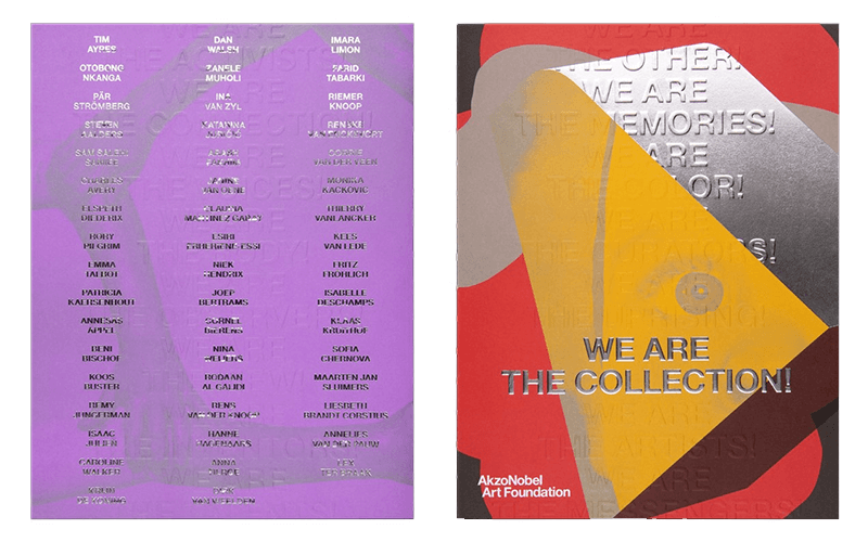
We are the collection
Since 1996, AkzoNobel has been collecting and exhibiting art from nationally and internationally renowned artists and young talents. Twenty years later, a publicly accessible art space has been added.
With the 'We are the collection-magazine' the AkzoNobel Art Foundation gives the opportunity to bring the collection to the reader. The colourful magazine has become a veritable treasure trove of artworks and stories.
It's in the details
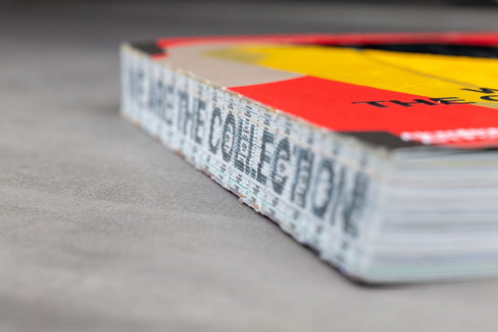
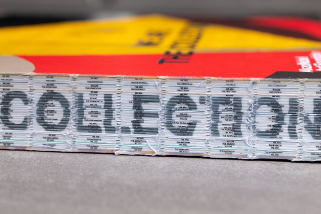
When you see the jubilee copy you immediately notice something. A normal cover is missing, which makes you look at the neatly bundled quires. The surprising effect? There are texts on the backs of the individual sections. Which, with some effort, can be read through the very small corps. On top of that you can read 'We are the collection' in silver letters.
Chris says: "Actually, the end result is a semi-finished product. Think of it as a rough diamond. But that is exactly what makes this work unique. You hardly ever see these details and that's why the result is exceptional. It's not a thirteen in a dozen production. In order to achieve this, you have to be extremely precise. Everything has to be thought out in advance in order to deliver a quality product like this".
Millimetre work
It turns out this is millimeter work. Each section has its own back (1 - 1.5 mm) which are then sewn together with yarn. Attention has to be paid to the prevention of folding differences, which should not be there. Chris: "If you're not meticulous, all words disappear. With that, the whole effect is gone".
The process at NPN Drukkers
As a printing company, you normally receive a fixed quotation request. Possibly with some alternatives. For the AkzoNobel jubilee magazine, things were slightly different. NPN Drukkers was involved in the project much earlier than usual. "In order to be able to oversee the consequences of the design choices, a kind of menu (at section level) was developed in consultation. To frame it in this way, this gave Kummer & Herrman the freedom to make faster choices within the budget. Of course you can't oversee everything, but in this process it worked well. In the end you make a final calculation when this process is finished". Normally the design is looked at first, but for the anniversary magazine the printing options were part of the design phase.
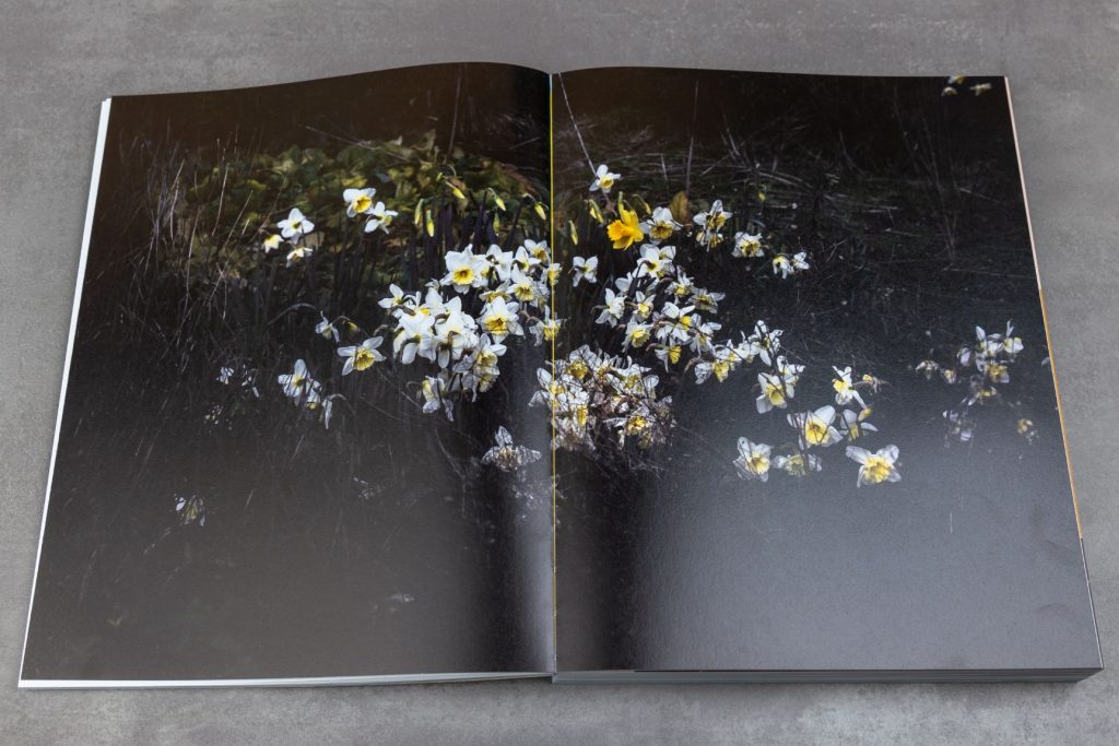
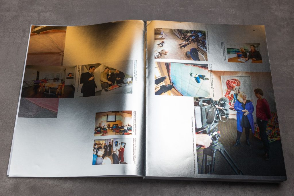
The moment you're in a creative process, it's always a matter of getting used to what it's become. Then something you have worked on for a very long time suddenly becomes concrete. It becomes tangible. But we are very happy with what's there!
- Arthur Herrman, Kummer & Herrman
Control moments
The most important thing in such a process are the control moments. Guaranteeing the quality can only be done by building in a control layer for each phase. This always means a pressing test in advance and in this case a dummy with printed quires. What does the image material look like on paper? Is this what the customer has in mind? But also: what happens with the glue in the walk-in? You have to be able to check this in a production dummy. With this chosen binding method this is extremely essential.
The same goes for the cover. "In consultation with KuiperDonse from Utrecht, after the printing sheets had been completed, we first had the foil, foil embossing and blind embossing tested. We thought carefully beforehand about the order in which it would be processed. Then it's nice to have partners who take the trouble to make such a test. That way you know exactly what you get afterwards. It takes a bit more effort, but it just avoids a lot of discussion afterwards. That way you avoid 'if only we had...'", Chris says.
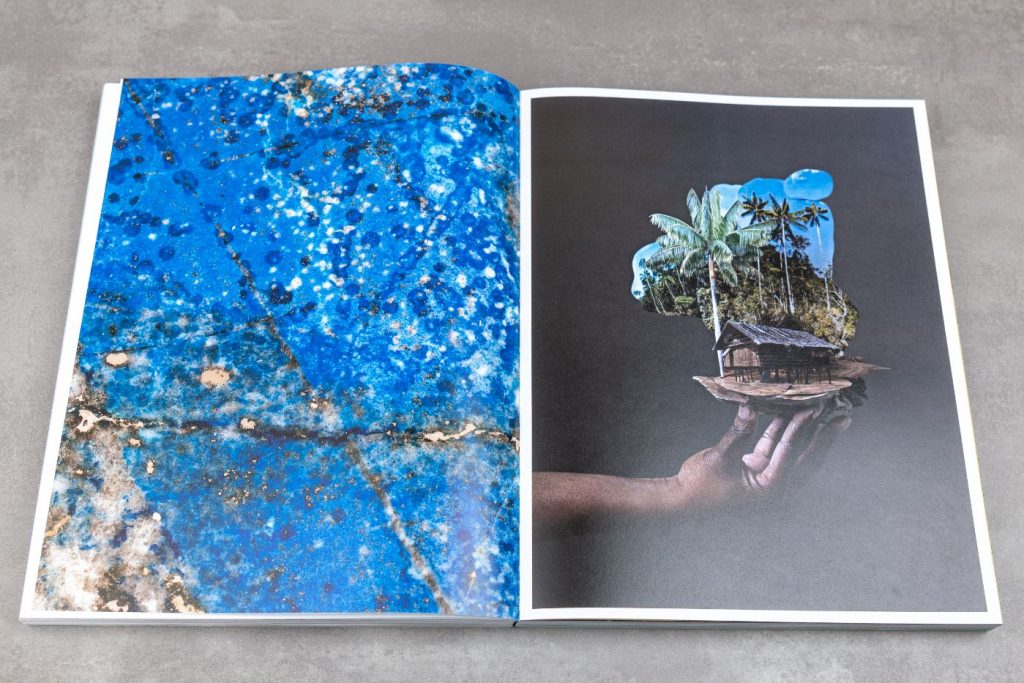
Result
All control moments are important to achieve the desired result in the end. Chris: "You want to give the customer a sneak preview. For this product we mainly wanted to show the unique binding method. So we also made a binder model. The advantage of these pilot stages in advance is that you avoid uncertain factors. At the start of a pressure start, the result can't be disappointing."
But also at NPN Drukkers it remains exciting when the printing press starts running. "When the first printing sheet comes off the press, that's a good time to think about it. The book finally comes to life," Chris says.
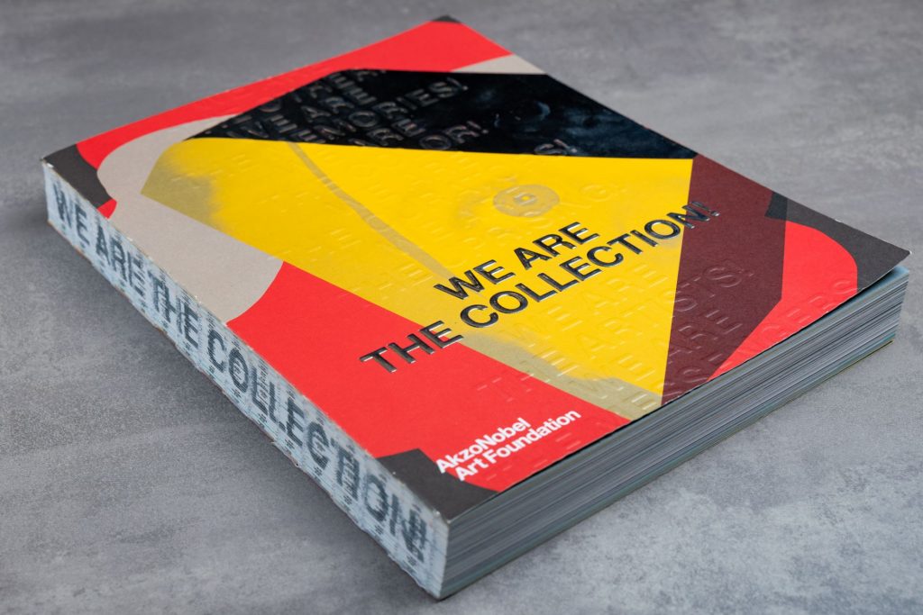
"Would we recommend NPN? Without a shadow of a doubt. That happens on a regular basis. It's nice to work with a party that has enough knowledge and experience and knows what's going on on the other side of the door'.
- Arthur Herrman, Kummer & Herrman
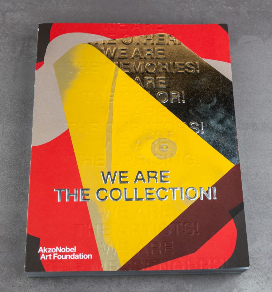
Magazine specifications
The circulation of the jubilee magazine is 3,000 copies. The inside consists of 428 pages in 2 x 4 pages cover, the largest part (380 pages) is printed on Magno Volume paper. In addition, 4 x 8 pages 100 grams Maxi Gloss, 1 x 8 pages 100 grams Maxi Satin and 1 x 8 pages 70 grams Holmen TRND. The size: 230 x 300 mm portrait.
Printing: Cover full colour + PMS silver + 6 extra PMS colours, 380 pages Magno volume 5/5 full colour + PMS silver, 4 x 8 pages Maxi/Holmen 4/4 full colour + PMS silver, 1 x 8 pages Maxi gloss 5/5 full colour + PMS 3395, 1 x 8 pages Maxi gloss 100% silver coldfoil + 4/4 full colour.
The finish is sewn with white thread and the back is glued with hotmelt. The finishing: page 1 and 8 cover v. v. silver foil Alu Fin Special (Kurz), page 1, 4, 5 and 8 with blind embossing.
